


As promised!
A revelation!

My philosophy about comics is that they aren't comics until they are printed. Until then, they're just drawings. Not to denigrate drawings, but it's the multiple copies, the ink, and the distribution that is the comics. As I said, it's personal philosophy. Don't @ me about it, bro.
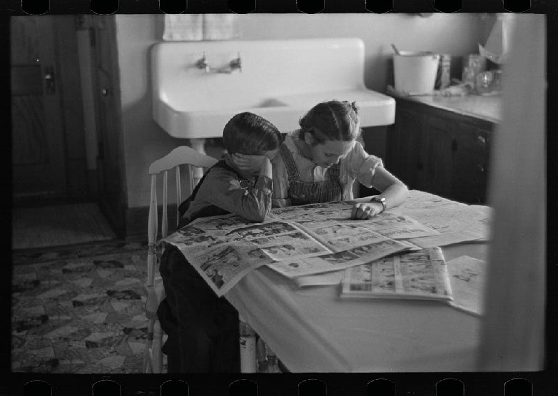
Photo by Russell Lee, 1936
Getting from the drawn page to the printed page is the job, the business, and the mission. How do we do that when we're working with ink and paper? I won't get too technical, but my approach springs from old comics. Comic artists used blue colored pencils, a tint called "non-photo" blue, to make drawings that an inker would ink over. When the printer made the film for the plates, the blue would get filtered out, leaving only the inks, completely hiding the underdrawing. Instead of using a regular graphite pencil, working this way cut hours of erasing out of the process. Publishers did anything they could to accelerate the process. My "new invention" is that I turned things on its head. (Of course, if you know of someone else working this way, please let me know.)
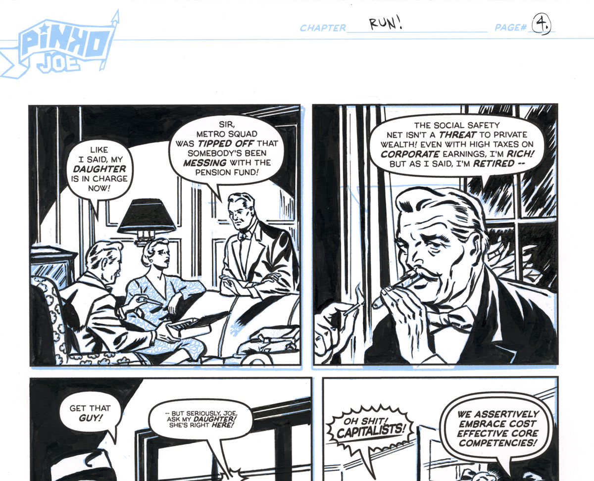
You can see the non-photo blue elements printed on the art board that I made for my 2020 graphic novel, Pinko Joe. Thanks to the magic of Photoshop, I made the blue vanish with ease.
I’m going to tell you the process that I've evolved. I get my students to draw in waterproof ink. They're making journal comics so the drawings can be rough or improvised. I try to discourage elaborate under-drawings, but if they feel they need it, I try to get them to use light pencils and draw lightly on the page (so as not to engrave the paper with their pencil leads).
Once students finish their inks, I get them to add a second color as an accent or shading. Rather than use a gray wash, I have them use a transparent, non-staining watercolor, like Cobalt Blue or Quinacridone Rose, to provide depth to their drawings or help identify people and things. For instance, there are two characters, and one has a shirt colored with cobalt blue. Or objects cast blue shadows — we can use Cobalt Blue as a substitute for a middle gray tone. For ultimate portability, instead of carrying around a tube of watercolor and a palette, I’ve found great results with Faber Castell Albrech Dürer watercolor pencils and a water brush. You can dab at the tip of the pencil with a water brush and then lay down some color. It’s absurdly simple.
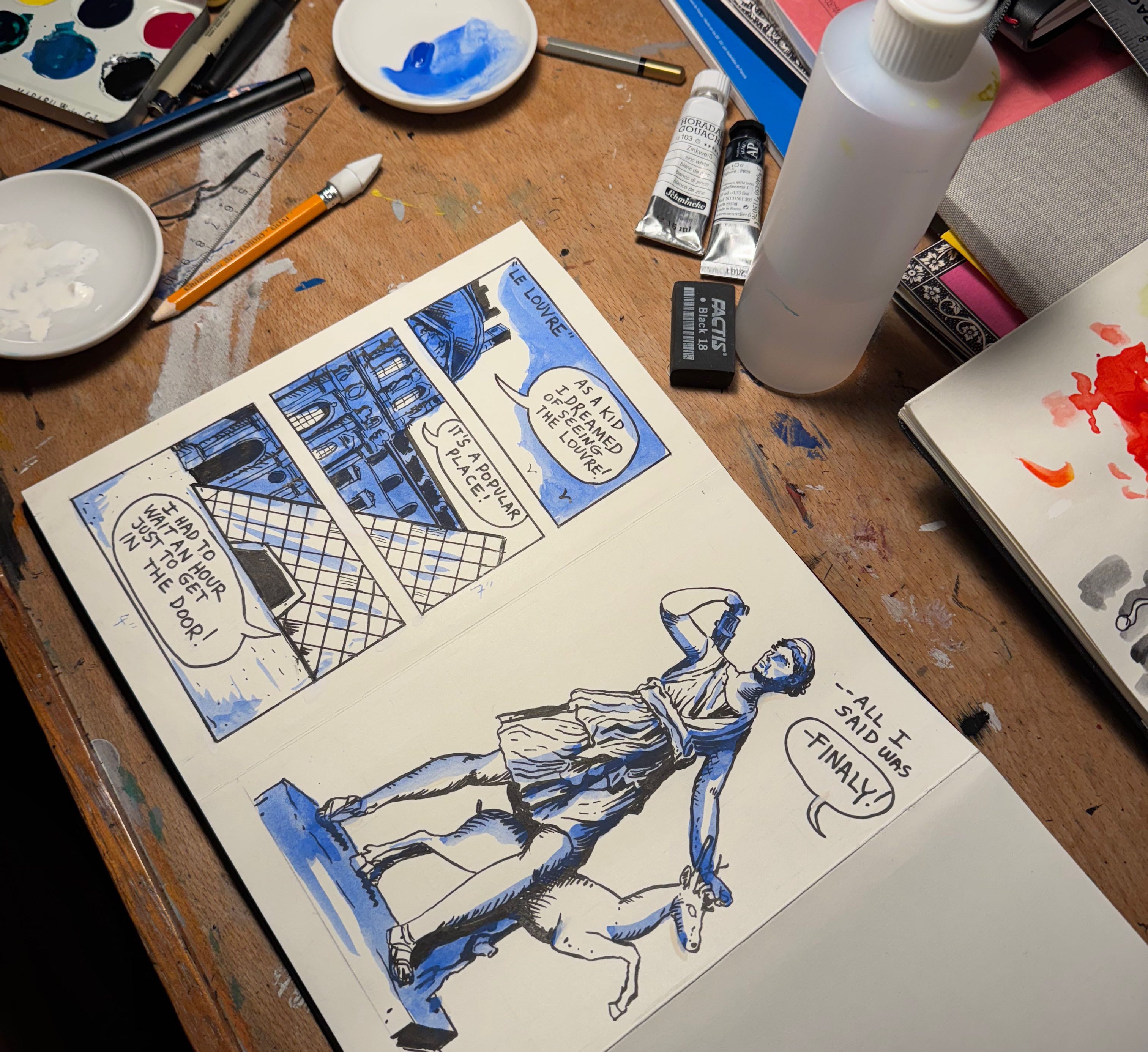
This is a demo comic that I made in about an hour. Waterproof ink over light pencils with a Cobalt Blue watercolor wash on the Moleskine accordion fold book.
When we scan the art into Photoshop, we duplicate the layer. In RGB mode, we can color key out the accent color using the Black and White adjustment, leaving only the black ink, just like "ye old-timey." Unlike the old process, we can then apply that "just black" layer to the duplicate layer we made, using it to block the ink drawing, leaving just our Cobalt Blue. We now have two layers of information, the black by itself and the color by itself. Now, we can manipulate and do many things with the color layer. I know it’s going to be tempting, but I’m not going to provide you with tech support, so please don’t ask.
Remember when I said comics are about printing? Having two clean layers, we can manipulate them by making two separate plates for printing. We could turn the color plate into a halftone if we're printing in one color, if we used it as a middle gray in our drawing, or we can just as easily print in two colors on a Risograph if we were thinking of the blue as a color when we were making the comic.
If you use a color distinctive from black in value and chroma, you could use a different color from Cobalt Blue. In my recent exhibition in Lisbon, I used Gamboge as the second color. In the case of these works, I replaced the Gamboge in Photoshop with a damaged halftone pattern, giving the drawings a vintage quality.
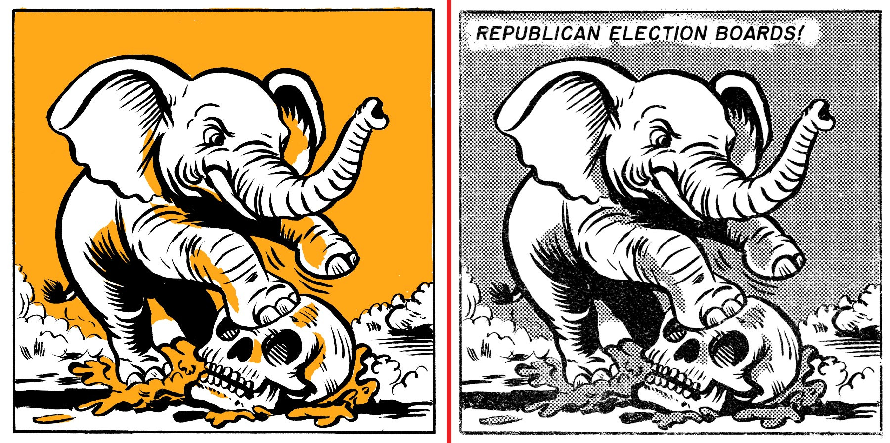
On the left is the ink and gamboge original drawing. On the right is the processed artwork, replacing the orange with a busted up old halftone. And I added some text in Photoshop.
I don't know if this is helpful or useful to you. This approach is only going to have limited appeal. It is worthwhile, given the limited options when drawing in the field and limited computer access. I like having limited parameters, as it forces one to be more creative. I like working analog, and this approach lets me optimize my time. It also yields nicer original drawings.
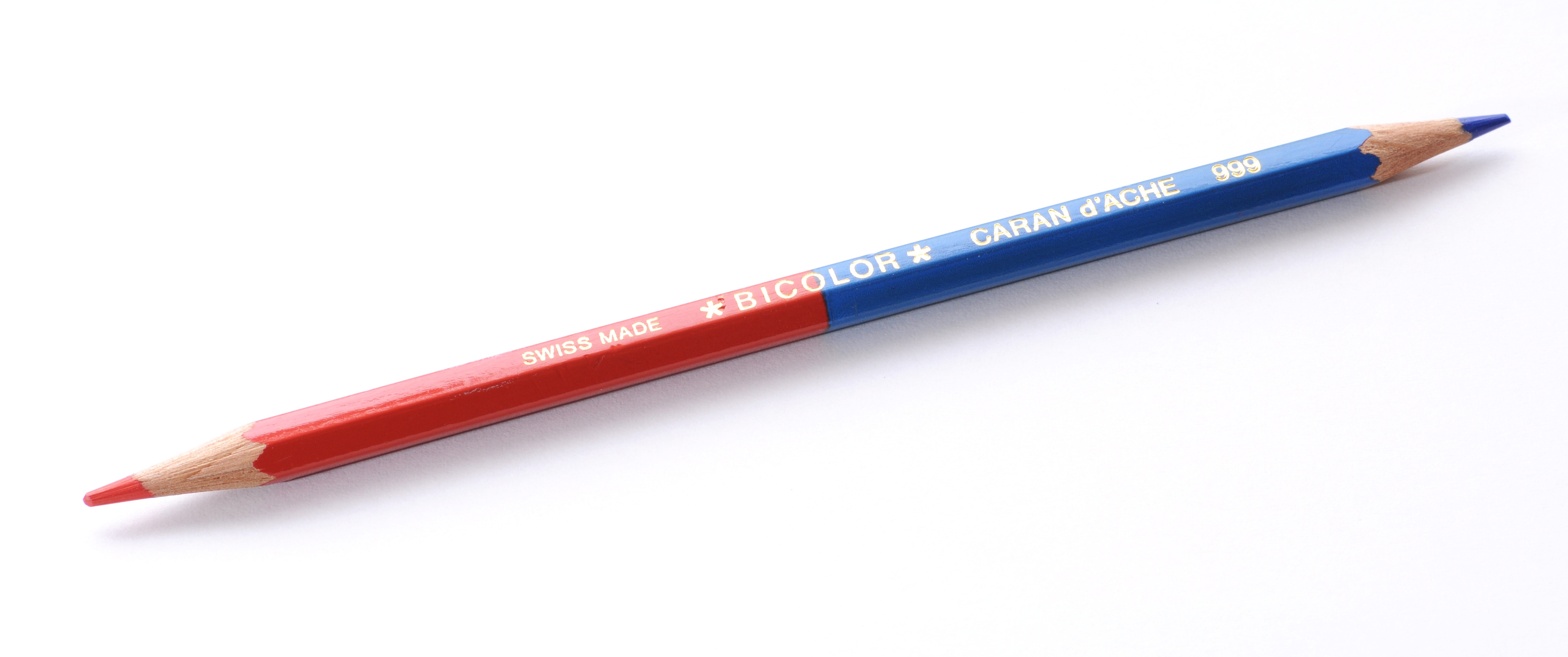
Lastly, a shoutout to the Checking Pencil. A thing since the 1870s, a two-color pencil with vermillion red on one end and Prussian blue on the other. Editors used these bi-color pencils to mark up copy; even today, some school children in Eastern Europe use them. I love the duality, so I decided to make my own double pencil (from the aforementioned Faber Castell watercolor pencils) using the Tsunago Pencil Splicer!
If you like this free newsletter, pick up my latest graphic novel. It's funny (of course, it's funny) and grim. Not for my sake, though. Buying my book supports the publisher, as well as indy book stores. Kuš! is an excellent, very small, worthy independent comics publishing company. You don't have to buy my book, but you could buy something from them. The worldwide shipping is free! If you like this free newsletter, you could also forward it to a friend.